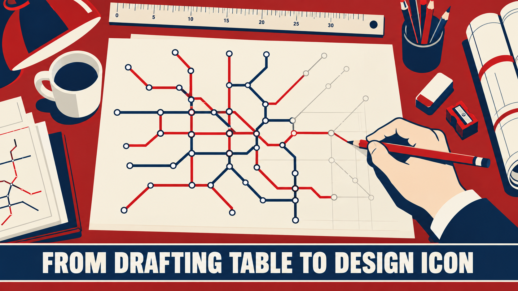
The History of the London Tube Map: How Harry Beck’s Design Changed the World
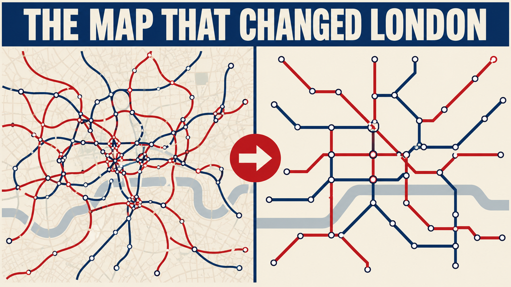
Few pieces of design are as instantly recognisable as the London Underground map. It’s been printed on tea towels, hung in art galleries, and copied by transit systems on every continent — but it didn’t start out that way. The history of the London Tube map is really the story of one engineering draftsman, Harry Beck, who looked at a tangle of coloured lines in 1931 and asked a simple question: what if a map didn’t need to look like the city it represented at all?
That question changed how London — and eventually the world — thinks about navigating a city.
Before Beck: The Problem With Mapping a Growing Underground
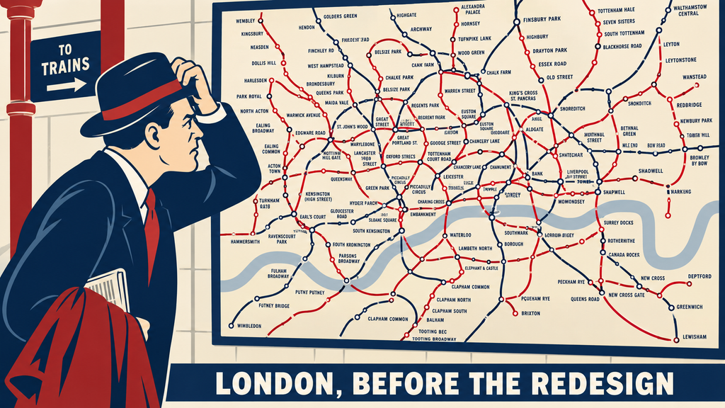
When the Underground opened in 1863, mapping it was straightforward enough: a handful of lines, laid over an accurate street map of London. But the network expanded fast, and by the early 1930s that approach was falling apart. Early maps tried to plot every station in its true geographical position, which meant the crowded central stations were squeezed into an unreadable knot of overlapping lines, while the outer suburban stretches dragged the whole map out into an awkward, oversized shape.
For a visitor — or even a fairly confident Londoner — working out how to get from A to B meant squinting at a mess of intersecting lines that told you everything about geography and almost nothing about how to actually make a journey.
Harry Beck’s 1931 Breakthrough: Treating the Tube Like a Circuit Diagram
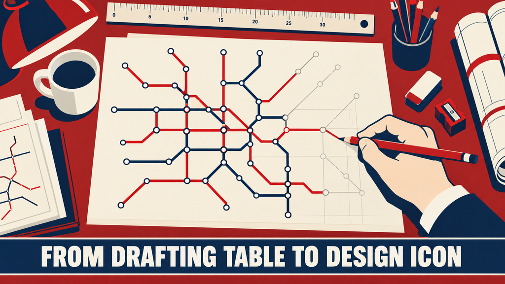
Harry Beck wasn’t a professional cartographer — he was a draftsman for the Underground’s Signals Engineering department, and it shows in the solution he came up with. Beck’s insight was that passengers travelling underground don’t actually need geographical accuracy. They can’t see the streets above them, so what matters is the order of the stations and where the lines connect — not the literal distance or direction between them.
Drawing on his technical background, Beck redrew the network as a schematic diagram, the same way he’d draw an electrical circuit: straight lines running only at 45- or 90-degree angles, evenly spaced stations regardless of real-world distance, and the sprawling outer suburbs pulled inward to fit a clean, compact frame. Geography was sacrificed almost entirely in favour of clarity.
London Underground’s publicity department was initially unconvinced and rejected the design as too radical. Beck kept refining it anyway, and in 1933 it was finally trialled as a pocket leaflet. Passengers loved it immediately — the first print run sold out within a month, and the geographically accurate map was retired almost overnight.
Most Beautiful Tube Stations – many of the stations Beck reduced to a simple white circle are genuine architectural landmarks worth a detour above ground.
Keeping the Vision Intact: The Victoria Line, the Jubilee Line, and Beyond
The real test of Beck’s design wasn’t 1933 — it was everything that came after. Every new line and extension since has had to fit inside a system that was never meant to expand indefinitely. The Victoria line arrived in 1968, the Jubilee line in 1979 and was extended again in 1999, and the Docklands Light Railway and London Overground were folded in over the following decades. Each addition forced a redesign, and each redesign had to resist the temptation to compromise on the two things that made the original map work: straight lines and even spacing.
Later designers made real changes — updated typefaces, revised colour palettes, zone rings, step-free access symbols — but Beck’s central principle has never been abandoned: a Tube map’s job is to get you from station to station, not to accurately represent the city above.
A Foodie’s Day on the Elizabeth Line: From Paddington to Canary Wharf
The Digital Tube Map: Real-Time Data, Same Design DNA
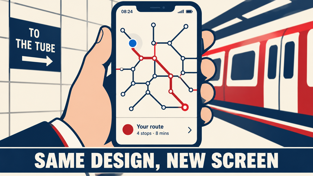
The map has now made the jump from tea-stained pocket leaflet to phone screen, and it’s arguably had to work harder than ever. Digital versions layer in live service updates, step-free routing, and journey planning that the printed 1933 leaflet never needed to handle. And yet open the TfL app or Google Maps in London and the underlying logic is still pure Beck: straight coloured lines, evenly spaced stops, geography flattened for clarity.
It’s a rare piece of 90-year-old design that hasn’t just survived the transition to digital — it’s the template every version since has had to work within.
More Than a Map: A London Icon
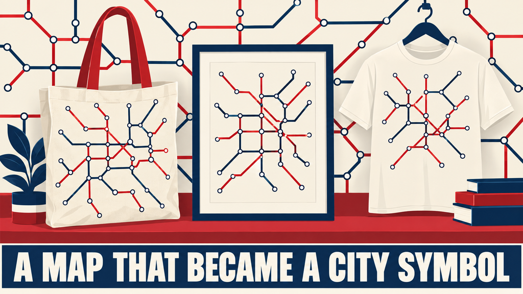
Somewhere along the way, the Tube map stopped being just a wayfinding tool and became a piece of London’s visual identity in its own right. It’s been reproduced on fashion prints, replicated for gallery exhibitions, redrawn as a guide to the pubs of London and the vineyards of France, and referenced by transit authorities from New York to Tokyo who adopted Beck’s schematic logic wholesale. Ask most Londoners to picture “London,” and the map’s coloured lines and white circles show up somewhere in that mental image, right alongside the red bus and the black cab.
That’s the real measure of Beck’s achievement. He didn’t just solve a navigation problem — he gave London a piece of design so effective that it became a symbol of the city itself.
The Metropolitan Line: A Complete Stop-by-Stop Guide
Frequently Asked Questions
Who designed the London Underground map? Harry Beck, an engineering draftsman for London Underground’s Signals Engineering department, designed the schematic map in 1931. It was first published in 1933.
Why isn’t the London Underground map geographically accurate? Beck redesigned the map as a schematic diagram rather than a geographical one, because passengers travelling underground can’t see the streets above them — what matters is station order and interchanges, not real-world distance or direction.
Was Harry Beck’s map popular immediately? Not with London Underground’s own publicity department, who initially rejected it. Once trialled as a public pocket leaflet in 1933, however, it sold out within a month and quickly replaced the old geographic map entirely.